|
Description
The charting module is very comprehensive and includes the following features:
| • | Intraday charts with up to 30 days with data |
| • | Historical charts with end-of-day data (number of years depends per source) |
| • | Customize time periods, layout, default settings and more |
How to access
Features
Chart tool bar
At the top of the chart window there is a tool bar you can use to modify the chart layout. This menu is also available by right clicking in the chart.

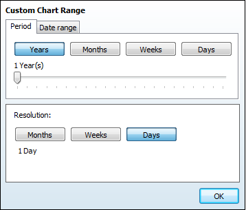
Time period and Resolution
Time Period can be selected from either the "Period" dropdown in the toolbar or below the chart as a separate toolbar. To add or remove the toolbar below the chart, click the wrench icon followed by "Show period toolbar". A custom dialog is available for selecting custom timer periods and resolution. The resolution can vary from 1 day to All available for intraday charts and from 1 month to All available for historical charts.
Technicals
A set of often used technical are available as default, in addition MRU technology will remember your most used studies and make them readily available in the same dropdown. By clicking the "More" button the available Technical Analysis studies will be listed. A dialog with the study parameters is available by pressing the corresponding legend box.
Compare
Available compare studies will show up in the the dropdown menu, MRU will also remember your most recent compares.
Events
From The event dropdown it is easy to add indicators such as adjustments and news. Multiple adjustments on/off per instrument in compare charts are possible.
Annotations
Annotations enables the use of trendlines, arrows, Fibonacci etc. Trendlines support start and end time by right clicking and selecting properties. There are two modes of drawing trendlines available in the application. Either by holding down ctrl or simply by drawing freely, to switch between the two modes go to Tools | Preferences |Charts, then check the box for "Use annotation zoom mode"
Template support
It is now possible to create own chart templates for different purposes in addition to templates provided from Infront. This feature also allows the end user to easily create a default template for each chart. There is a selection of templates added to show the new possibilities in the chart interface.
Settings
Percent study can now quickly be added to the left axis and better support for gridlines. The symbol parameters command shows a dialogue with parameters specific for the selected symbol. You can choose a chronological axis for historical charts and configure an Update filter to remove extreme values.
Scroll bar
The scroll bar changes the time period (start- and end date displayed) and it is possible to move the selected time period to the desired position.
Chart cursor
Click the chart cursor button to enable a cursor that will show the current values of any point in the chart. A large cross will follow the mouse cursor and show the following information ’Timeline’ with the cross: Date, Time, Open, High, Low, Close, Volume and Axis. The Axis value is where the mouse cursor is. In addition the legend (in the top left corner) of all lines and studies in the chart will show the current value.
Zoom in and out
You can zoom by clicking the chart with the left mouse button, keeping it down, and dragging the mouse to the lower right. When the desired area is highlighted, release the button. To zoom out, draw the square from the lower right to the upper left.
It is also possible to do a free hand zoom. By both holding the <Alt> key and mouse button down, a box is indicating the area to zoom while dragging the mouse in the chart.
Drag and drop
Click on a symbol and hold hold down both the mouse button and the <Ctrl> key. Then drag the symbol to a chart window and release the mouse button. The symbol will be added as a compare study to the existing main symbol.
What compare study to add can be configured in the chart setup dialog as a default drag and drop action.
A list of symbols can also be dragged and dropped in the chart. Do a multi-select in a symbol list window and drop it in the chart. Please note that it is not necessary to hold down the <Ctrl> key to drop a symbol list.
Target currency
Target currency can be changed in order to quickly see the graphs in another currency than the symbol's own trading currency. Click "Settings" in the to toolbar menu and click on the "Currency" sub menu. Select the desired currency from the list of available currencies.
This feature is only available if the application has access to the World Forex (WFX) feed .
Other features
Legend
The legend displays all lines and studies currently present in the chart, to remove or edit parameters press the corresponding legend.
Chart Type
By clicking the legend it is possible to change the chart to :
Horizontal Axis
By right-clicking directly on the horizontal axis in the chart window, you can toggle the settings for the grid lines and show first date/last time.
Vertical Axis
By right-clicking directly on the vertical axis in the chart window, you can toggle the settings for a logarithmic scale, show last marker, show grid lines and show legend.
Zoom scrollbar
Handles on both sides of the bar to adjust time periods, and only one bar to simplify use. The zoom scrollbar works very well with the ranged values:
| • | Select a set period i.e. 1 month with the scrollbar in a 3 Year period and drag the scrollbar to view performance in a monthly timeframe. |
Ranged values
New values are added to the top of the chart menu, these values reflect the time period selected in the chart.
| • | Accumulated Volume for intraday charts and Average Volume for historical charts |
Watermark
Watermarks are now supported, it is possible to choose between ticker code or description.
Other chart features:
| • | Unique colors of the lines in charts when adding a study |
| • | Add percent to left axis from settings chart menu |
| • | X-axis display of time points will change depending on size of chart |
| • | Possible to change instrument on compare studies by clicking the corresponding legend |
Tick-by-tick chart limits
By default the client will download up to 4000 points of tick-by-tick data. The user can override this limit in the Tools | User Interface dialog. Note that tick-by-tick data normally is only available for the last trading day from the servers.
|


