How to access
Right click on a an instrument > Charts & Visualization > Orderbook Visualizer
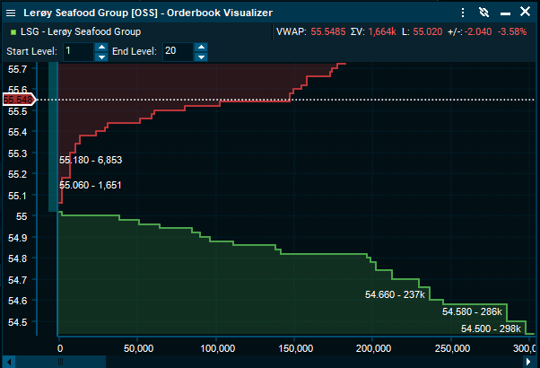
Interpretation
The OB Visualizer has a X-axis representing the aggregate volume (sum of volumes at each price level), and a Y-Axis representing the price. The chart displays what is the available liquidity at each price level of the order book. One can think about it as “who is willing to buy at $10, would also like to buy at $9; Who is willing to sell at $10, would also like to sell at $11”. Because of this logic, we can see it as an aggregation of the volume in a stepped fashion, where each step represents the next price level (that since they are more favorable to the trader sitting on the best bid and offer, we can aggregate them.
The graphic display of the Order Book has two main objectives. One is to deliver an easy-to-learn chart that enables the user, in a matter of seconds, understand the market sentiment for the security under analysis for a given day; the other, to infer changes on the expectations about its fundamental value and perceived risk, as well as capture intraday market microstructure imperfections that create price distortions.
For the identification of the market sentiment for the instrument, the scope of interest is high since the order book is more informative about the aggregate supply and trading interests than quoted volumes and prices. With the possibility to compare today’s liquidity dynamics with respect to averages, the analysis will be enhanced allowing the user to spot changes on the instrument’s liquidity supply. Moreover, the range of prices at which the chart analysis is performed has also different usages. Let us consider the analysis of the time series. The timeframe selection is obvious and it depends on the user’s interest, and this will also define the price range under analysis. Working with a live feed of the Order Book, the range selection is less obvious and we then provide the user with Range Filters that will facilitate the reading of the chart and the inference of information. If the user analyses the order book with the full range, i.e. from the minimum value of Bid and the maximum of Ask, then the use of the OB Visualizer is to read changes on the expectations regarding the fundamental price of the instrument. For example, one might notice that closer to earnings release dates the shape will tend to widen, i.e. the bid and ask legs will spread out.
On the other hand, and shorter price rage is best for analysing intraday market microstructure imperfections and profit from its mean reverting dynamics. In addition, the shape of the order book reveals a lot of information regarding the fundamental characteristics of the firm: solid, larger, and liquid companies tend to have a distribution of order prices that converge in the current best bid and offer; on the other hand, small, less stablished companies, tend to have limited volumes and a high price dispersion.