Infront Professional Terminal
Version 8.6.400 Release Notes
The latest 8.6.400 release of the Infront Professional Terminal includes several improvements and fixes optimizing performance and workflow with emphasis on the following new features:
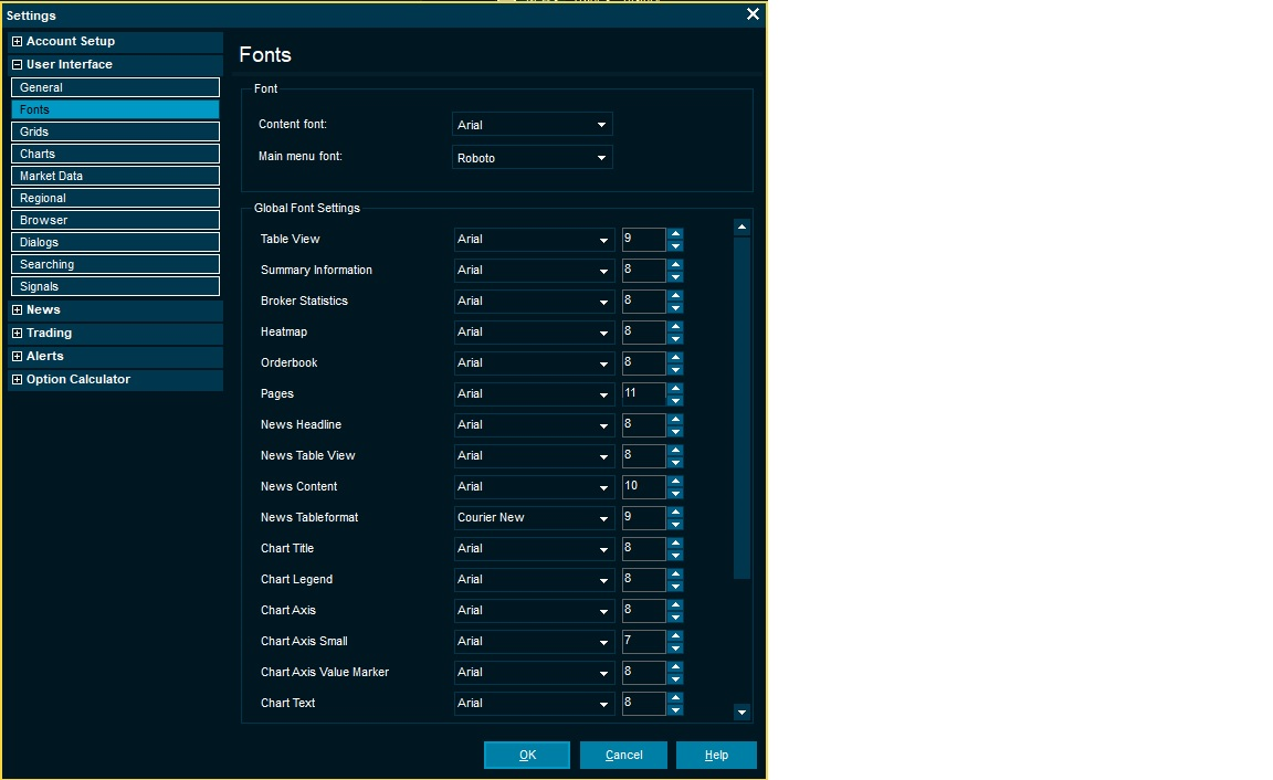
Now you can easily apply your preferred font size and text style to all your exsisting and new windows in one go.This provides consistency and saves time as this previously needed to be configured repeatedly.
Windows can still be individually tailored in the familiar window settings if preferred.
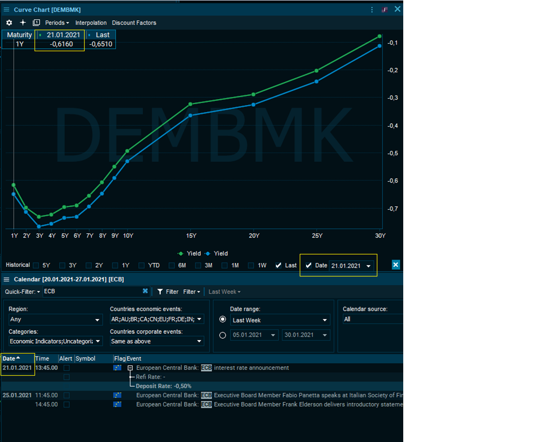
Discover how forward, swap or yields curves reacted to historical events such as ECB announcements, Inflation news and market incidents on specific dates. The date specific lookback allows you to uncover movements and shifts in the curve for a particular day in question and enables you to pinpoint your preferred point in time.
In this case we see the German yield curve and how it reacted to the ECB announcement the 21st of January in green with a slight shift vs. the current view from the Last curve in blue.
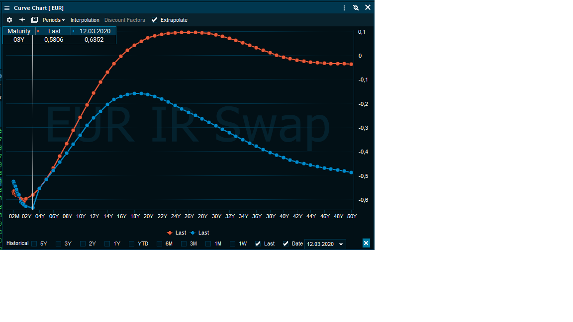
You can apply the date specific compare function by checking “Date” in the bottom right corner in any curve chart to discover shifts in IR swap curves, FX Forward curves, CDS curves etc
Interest rate Swap curve in Euro’s the 12th of March 2020 when WHO declared Covid 19 a global pandemic compared to the current Last value (in this case 1st of February 2021)
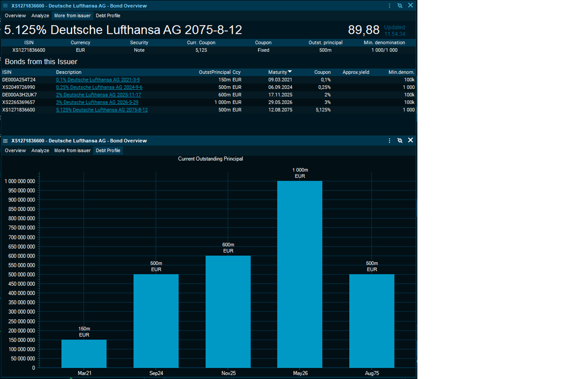
Visual breakdown of a company’s issued debt, when it is maturing and respective notional outstanding amount. You can hover each bar to view coupon and additional data.
If bonds are issued in different currencies the chart automatically currency converts to your selected conversion currency in order to compare them to scale in one axis.
From “Bond Screener” or any search, open the bond overview and on tab “More from Issuer” you can see if there are other bonds from the same issuing entity of the corporate, government or municipality. The Debt profile tab will chart these and you can easily view the distribution of debt with respective maturity uncovering when the outstanding principal is maturing requiring the issuer to either pay back, refinance or restructure the loan. You may further analyse their cash flow and earnings ability to do so in the Company Analytics.
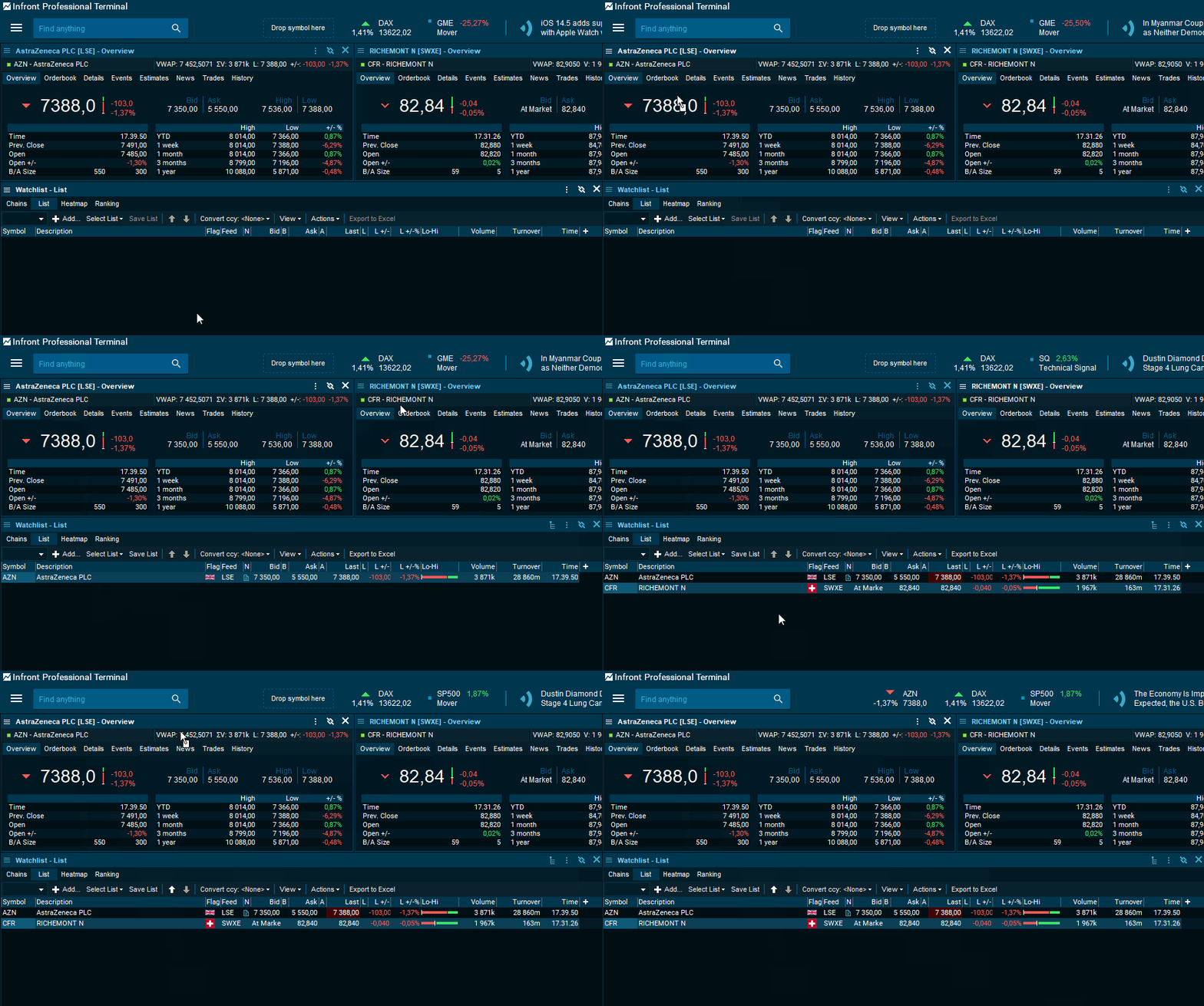
Anywhere you see the Green symbol info you can drag and drop it into a Watchlist allowing you to build lists based on already identified Instrument Overviews, Company windows etc.
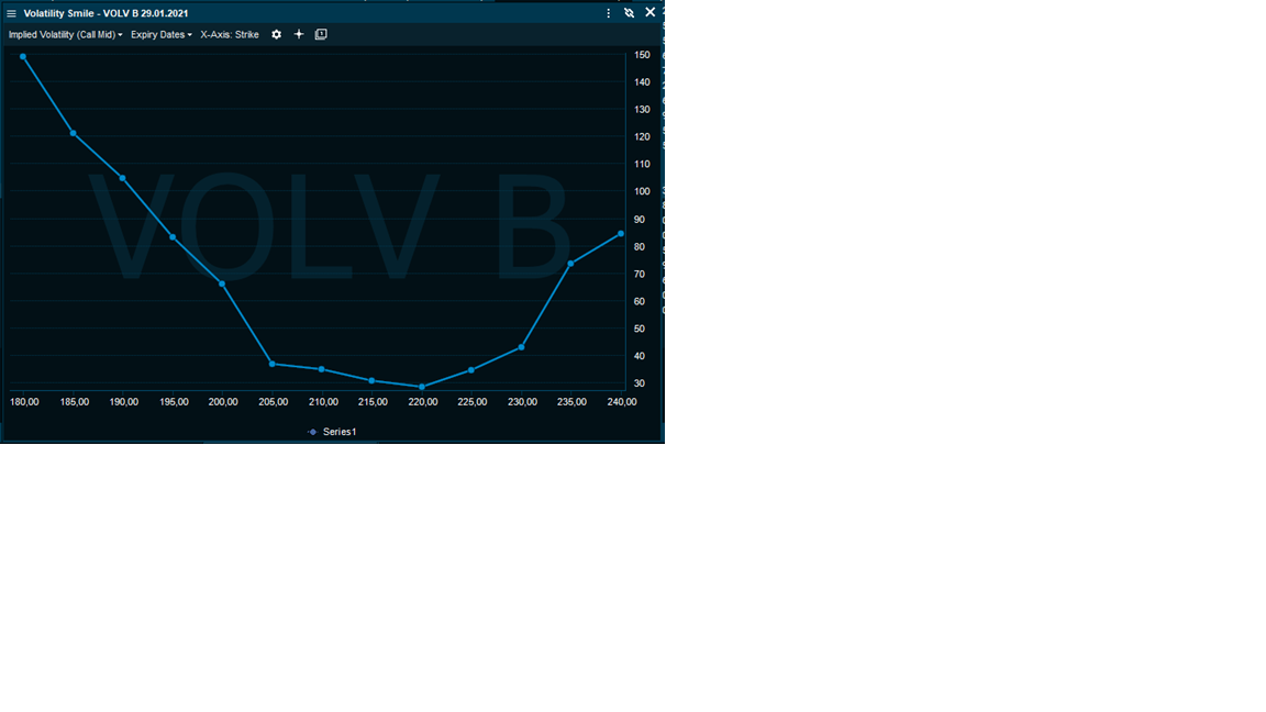
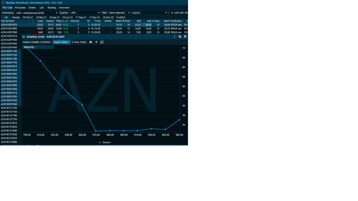
The Volatility smile charts the Volatility of an Option across Strike prices. It visually represents how Options with the same underlying and expiry date are valued base on implied volatility across strike prices.
Open an Option market, right click and select Volatility smile under charts and a series of 6 steps below and above of strike prices are selected and is charted to easily see if the typical U shape for your selected Strike range and it’s Moneyness (ITM, ATM or OTM) applies or if market perception differs to the traditional pattern.
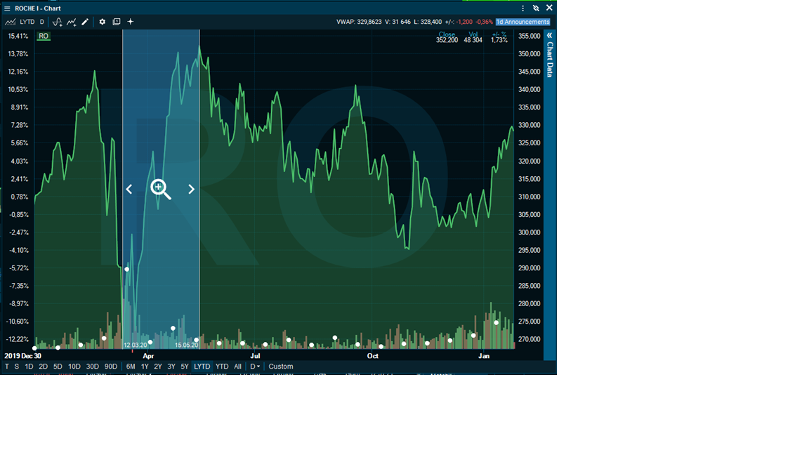
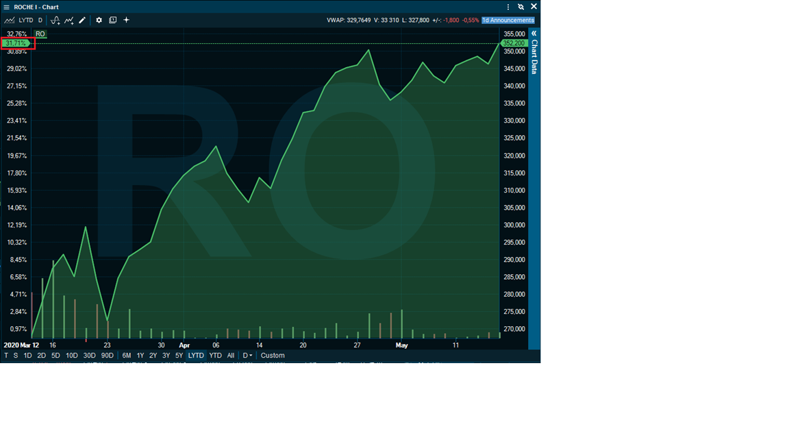
I can quickly zoom in on a particular time period within a chart and the percentage performance on my left axis will adjust automatically recalculating the return for that period.
For instance for Roche I would like to take a closer look at the extreme movements as of Covid-19 hit and the lowest point at 12th of March to the recovery back to the top at 15th of May.
After zooming in on this specific period of my choosing the percentage performance is readjusted on the left axis and we can quickly see the periods return on 31,71%
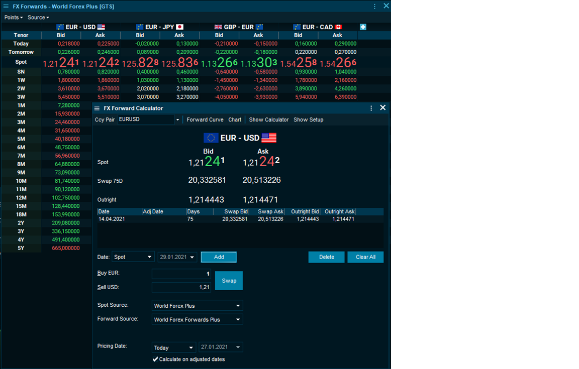
- Currency pair is split into two parts "Base" - "Quote" and shows a flag per currency
- Spot prices are displayed with enhanced decimals in FX Forward Calculator, FX Forwards window and Instrument overview
- Swaps and outrights are displayed with a fixed decimal percision = 6
- Clarification on Swap and Outright components
What was new in 86.300
The probability of the whether the Option will expire in or out of the money. Probability of Profit fields also takes into account the element of the option premium to express the actual net profit.
- Probability of In-The-Money (ITM)
- Probability of Out-of-The-Money (OTM)
- Probability of Profit (P.o.P)

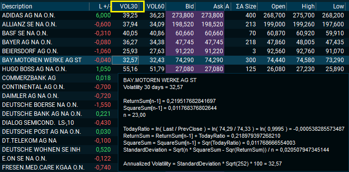
By hovering over the Volatility value you will get a detailed explanation of the calculation methodology and respective calculation.
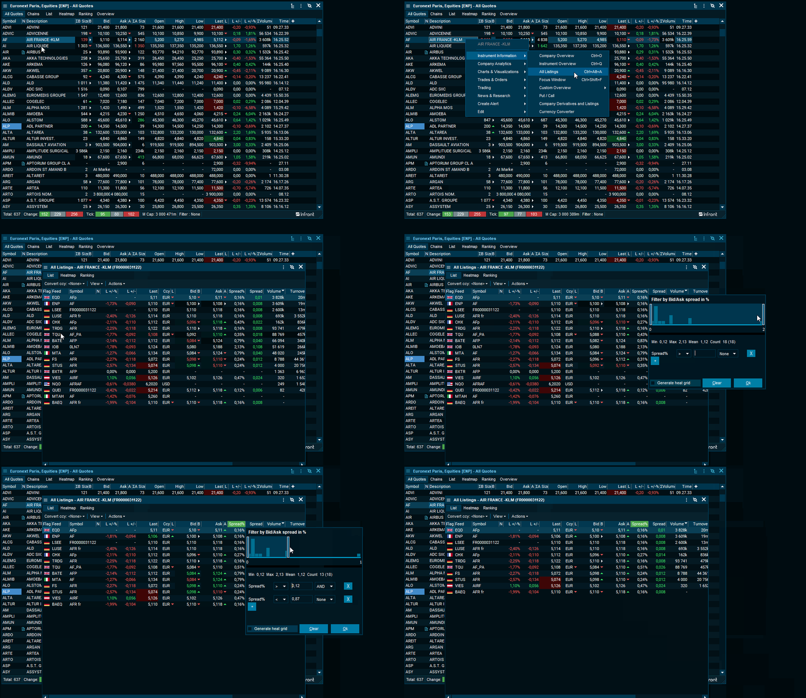
- Open by right clicking on any stock and select All Listings from the Instrument Information menu (shortcut Ctrl+Shift+T)
- Quickly identify and monitor price discrepancies across trading venues on a single stock.
- Capture arbitrage indications and ensure best execution.
- Screen and filter for best spreads, volume, price levels++
- You can now rename a list using the Rename List command from the Actions menu

- Discover and identify funds to your specific mandate and preference through a comprehensive screening tool within Infront’s independent fund data universe.
- Multi language Investment mandates
- KIID documents
- Chart benchmarking

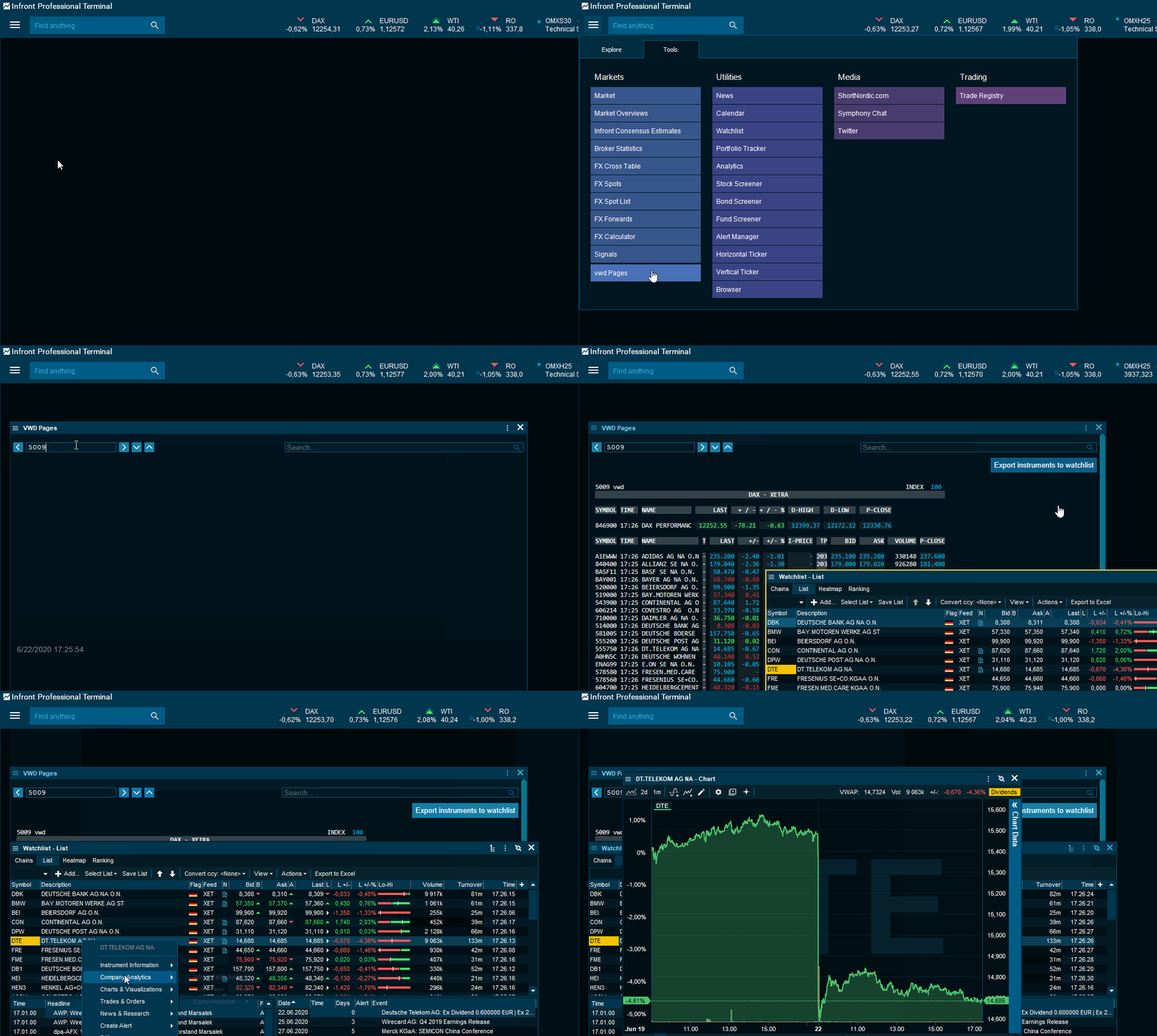
- The integrated VWD pages provide an easy way to search for instruments primarily by contributor source on prepared market pages.
- Open the integrated pages in a watchlist for interaction with complete terminal capabilities.
- The familiar workflow from your favourite pages can be adopted by saving these as your personal watchlists.
- What was new in 86.200
- VWAP studies in chart
- New rtADV fields - identify high relative traded volume
- Trading: RSP Quote Requests
- Chart: Export features have been improved
- Chart: Custom chart range now works better
- Instrument overview: Copy specific field
- Integration links to ShortNordic.com
- General
- Usage statistics
- Open watch list from global search
- New symbol search design
- Seasonality matrix with period selector (NEW in 8.6.100)
- Orderbook indicates high and low prices (NEW in 8.6.100)
- German language (Beta)
- Curve Chart improvements (NEW in 8.6.100) [Video]
- Save and retrieve named curves
- Edit curves, manually adding symbols
- Redesigned curve chart setup dialog
- Other improvements
- Chart [Video]
- Lists
- Watchlist: Embedded orderbook (NEW in 8.6.100)
- Inline column adder
- Multiselect using CTRL+Click
- Categorized columns
- News
To navigate, please use list above (links) or the buttons in the top navigation bar.
Note: Anonymous (non-personally identifiable information) usage statistics is collected to help improve our services. If you don't want to participate in our statistics, you can change this setting.
What was new in 86.200
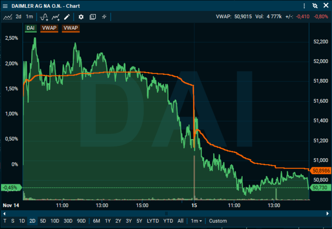
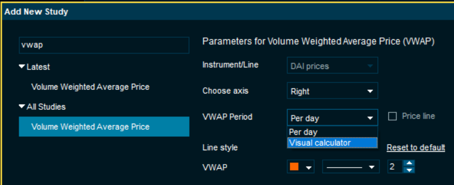
- VWAP (Volume Weighted Average Price) studies are now available in intraday and historical charts.
-
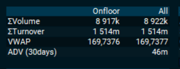
New rtADV fields - identify high relative traded volume.
[Note that this feature is only for available for unconsolidated feeds at this time. If you have a sigma (Σ) in front of the Volume column, you have an consolidated feed. To open the unconsolidated version of the feed, prefix a "U" in front of the feed code. For instance UOSS is the unconsolidated version of OSS.]
We always had support for the ADV (Average Daily Volume) field - but that only told you what the average trading volume was for a full day, and it was hard to compare that against the trading volume in the beginning or middle of the day.
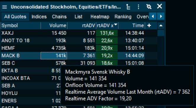
The new rtADV field tells you how much the average trading volume is, at this point in time, during the day. So you can compare it directly with the (on-floor) volume of the instrument.
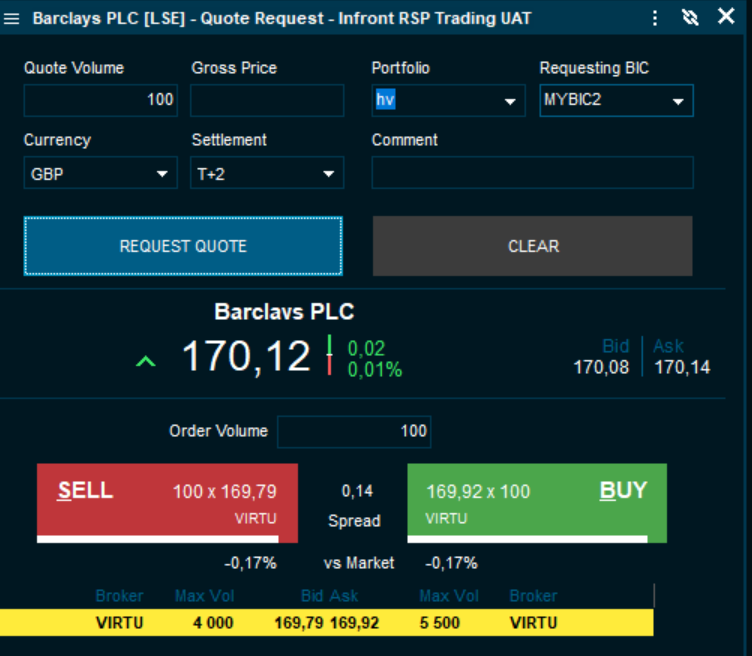
- Trading: RSP Quote Requests
This as a new trading feature meant for brokers that operate in quote-driven markets.
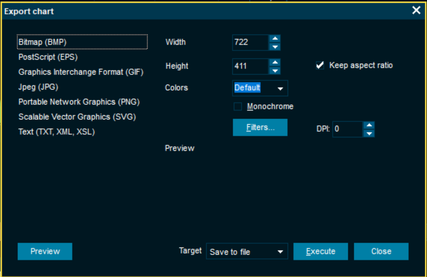
- Chart: Export features have been improved
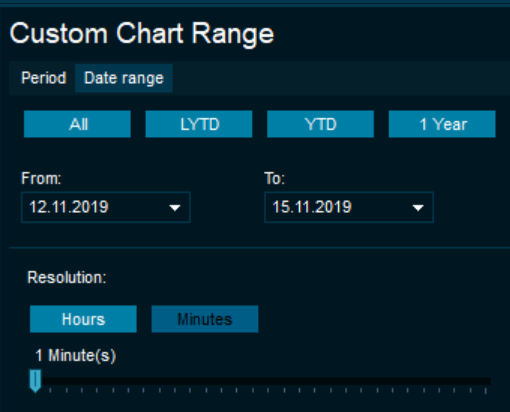
- Chart: Custom chart range now works better
- Instrument overview: Copy specific field. You can now simply double-click on of the values in the Instrument Overview and it will be copied to the clipboard.
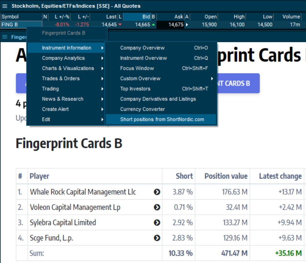
- Integration links to ShortNordic.com - available in the right-click menu of the Nordic stock markets.
For more information see their web site.
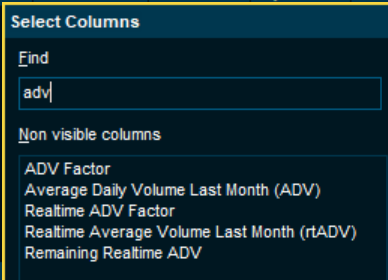
We also calculate an rtADV Factor that says that a given instrument has traded, say 3.5x, of the average so far today.
You can add these as new columns, and even sort on them. Even if you don't have the columns, hints of all the volume fields will show the values.
Also note that the Motion Detection feature will be updated to use this new data to give even more high quality signals about unusual trading volumes.
General
- Open watchlist directly from global search - just search for your list name
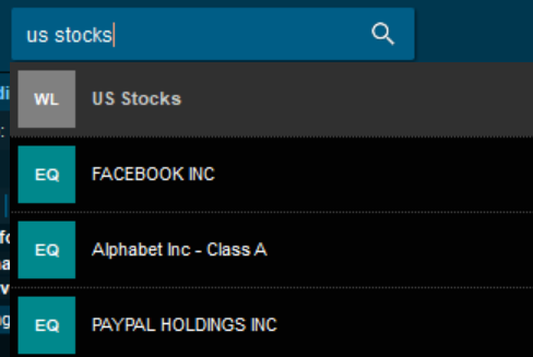
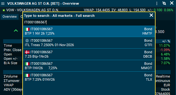
- The symbol search has been redesigned to be more intuitive
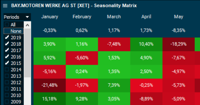
- Seasonality matrix now has a period selector - to control what years are included
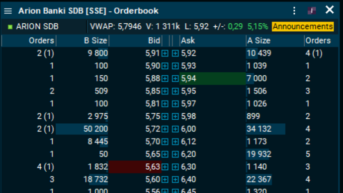
- Orderbook now indicates high and low prices with green and red
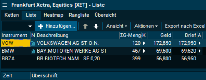
- German interface language is now available (Beta).
To change the language, go to Advanced settings -> Regional -> Select language
Curve Chart
[Video]Major curve chart improvements
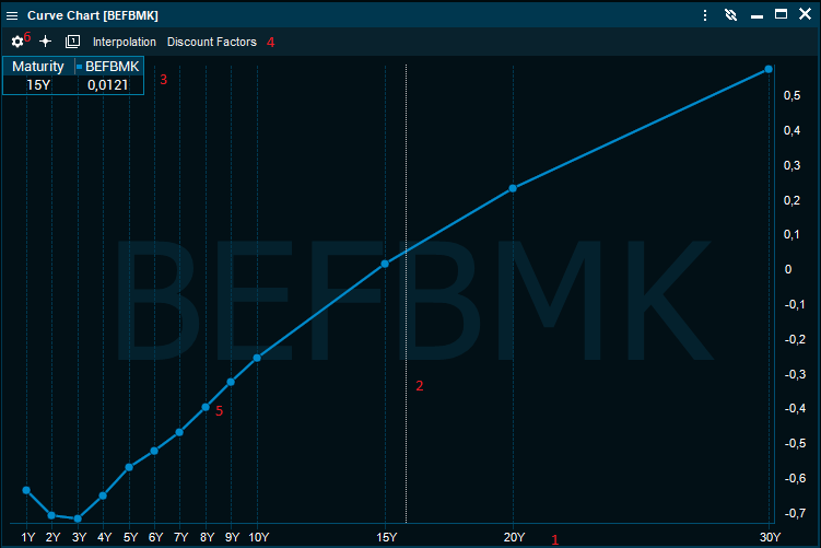
The curve chart has been modernized and aligned with the general instrument chart.
- The tenors or dates along the x-axis are spaced out in time
- Chart cursor shows the value for the nearest point
- Cursor value window shows the nearest tenor and value for the cursor
- Toolbar has new buttons for setup, cursor on/off and load curve
- Click on a curve to select it, press [Delete] to delete it, double-click to open setup
- Click the setup icon to open the setup dialog
Edit, save and retrieve named curves
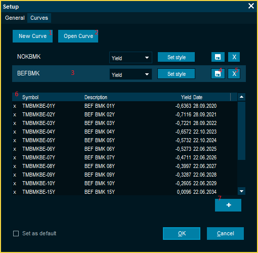
You can now create a empty new named curve and add symbols to it and open saved curves.
- Create a empty new named curve and add symbols to it
- Open a saved curve from file
- Click on a curve to set preferences for it and see the content in the grid below.
Click on the name to change it to a better description (3) - Save the curve to a local file
- Delete selected curve
- Curve content grid shows symbol name, description, yield or lastand date
- Add one or more symbols to the selected curve
Quickly compare currency yield curves
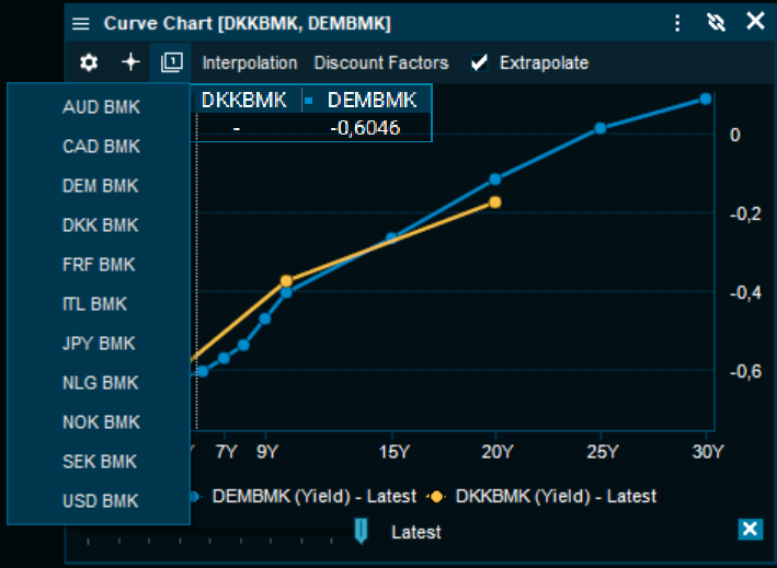
There are a number of pre-saved currency curve lines available to quickly compare yield curves. Just use the curve line drop down button on the toolbar.
Chart
[Video]Improved design and interface
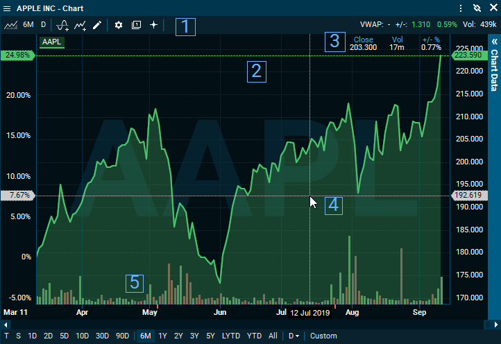
We have created a new design to tidy up our toolbars and make it easier to interact with the chart:
- New toolbar: We have merged our "summary-bar" and "toolbar" to one, and replaced text with icons.
- Price line: visually indicate the current price level.
- Hover data: When cursor is ON, a data-table is displayed for selected date.
- Hover price: Price level on right-axis on hover
- Volume bars: are displayed in background as a visual indicator
All these elements are now part of default template.
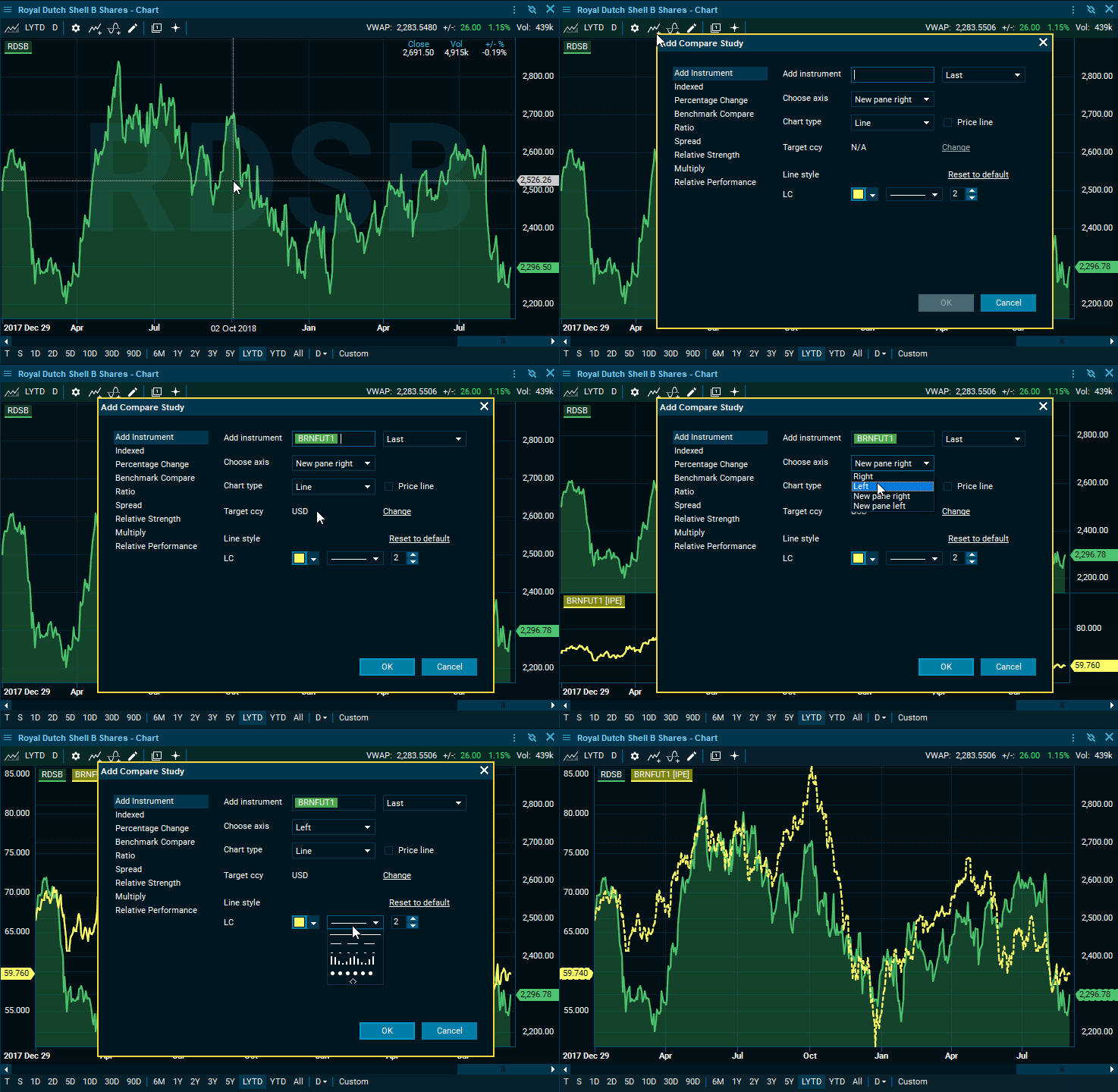
New pop-up dialogues
We have designed new pop-up dialogues to make the navigation simpler:
- Settings: All settings are gathered in one place. With preview mode you can see the changes instantly.
- Add Compare: Simplified naming of studies and a new view to add new comparison studies and ability to select axis.
- Add Study: Simplified the view to give a better overview.
Other improvements
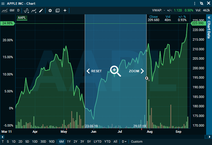
- New design for our zoom with dates visible on bottom axis.
- Improved scrolling: Smoother panning left/right
- CTRL+Scroll: Zoom in/out
Watchlist
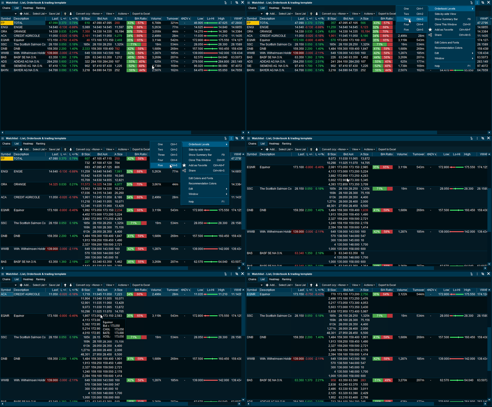
Embedded Orderbook
To help you stay on top of the market and be able to act faster, we have created the ability to have a list of orderbooks inside your watchlist
Inline Column Adder
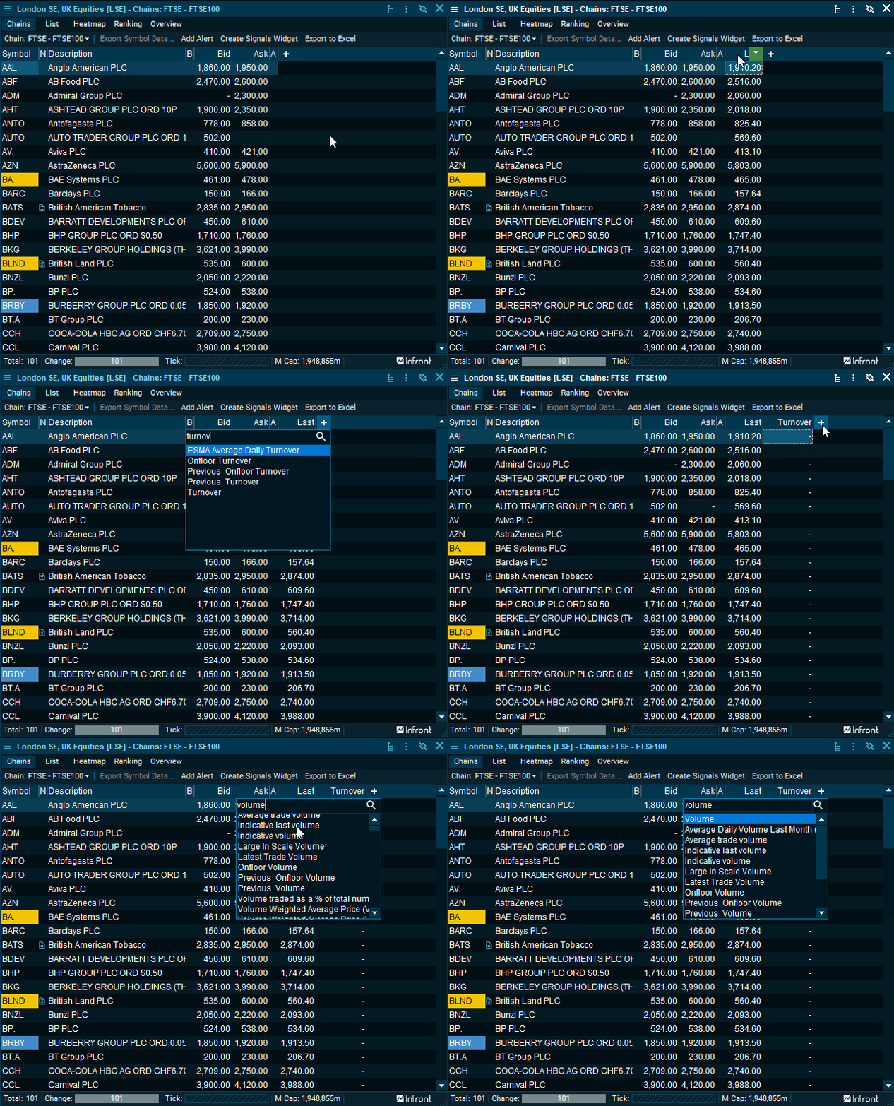
We have made it much easier to add new data-columns in our lists-windows. By using the "+" icon, you will get a search bar that let you search and insert the selected column.
Protip: When in a lists window -> Press keyboard button [Insert] to activate column adder
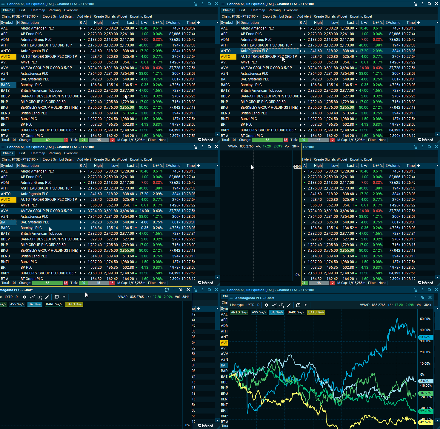
Multiselect using CTRL+Click
With the new update, you have the ability to multiselect multiple instruments:
- CTRL+Click: to select multiple instruments
- CTRL+Drag: to select blocks of instruments
Protip: After selecting multiple instruments -> Use shortcut CTRL+I / CTRL+H to compare selection
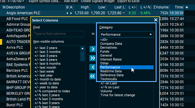
Categorized columns
We have made it easier to discover and find the data-column important to you.
News
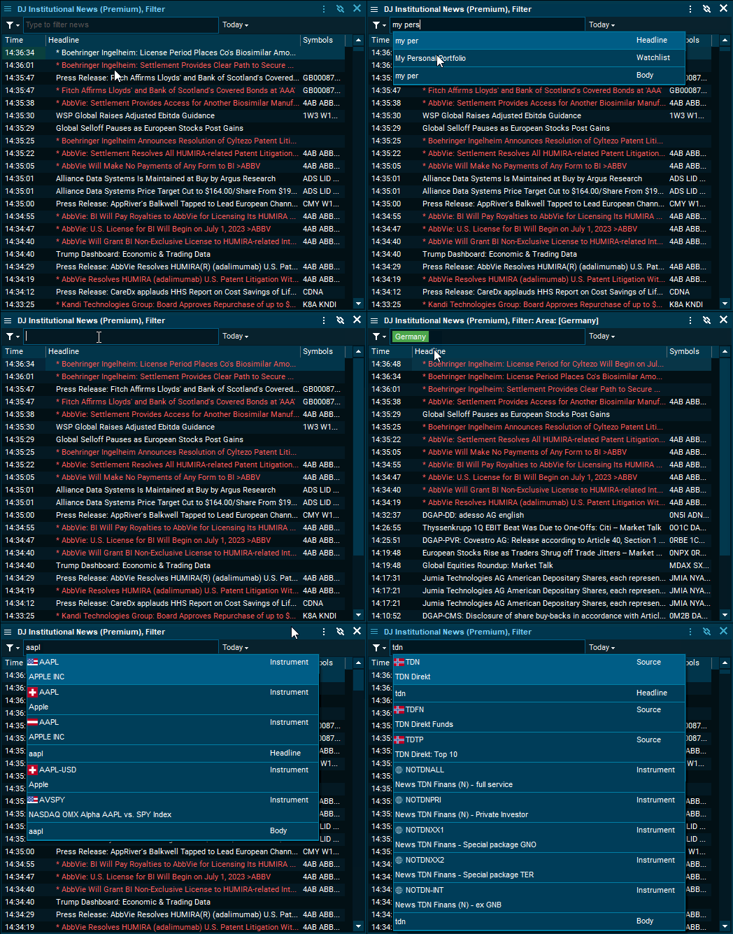
New search bar
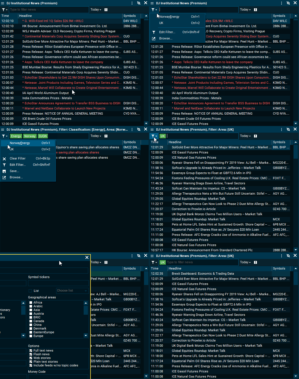
We have created a new search bar that allow you to filter on anything (Categories):
- Instruments
- Watchlists/Personal lists
- Classifications (Topic tags)
- Geographies
- Sources
- Headline- and body-search
Filtering within the same category will activate OR, while across categories will be AND. Examples below:
- Filtering on Apple(Instrument), Tesla(Instrument) and US(Geography) = ((Apple OR Tesla) AND US)
- Filtering for US(Geography), Energy(Classification) and "Earnings"(Headline text) = US AND Energy AND "Earnings"
Filter menu
To make it easier to filter and find important news, we have created a filter-menu with new features:
- Old filter dialogue
- Ability to save various filter combinations
- Easy way to switch between pre-defined filters. You can also use shortcut CTRL+[Num] to toggle between the filters
